Let's talk email marketing - We’ve put together a list of our favorite email design best practices to help you increase open rates, drive conversions, and grow your customer base in 2023.
Research shows that in 2019, roughly 294 billion emails were sent worldwide every day. That figure is expected to reach 347 billion by 2023.
Yet many of these emails remain unread, or even worse – unopened. They get marked as spam, deleted, or completely ignored.
That’s why a well-designed, attractive email is essential to drive engagement and conversions. From the moment an email appears in your reader’s inbox, you want them to feel compelled to click through, even after just a glance. Beautifully designed and informative emails result in greater ROI and fewer unsubscribers.
To make the most of these best practices, follow along in your Team Debello-Magnetic Leads account and create your own stunning email content. Don’t have an account yet? Create one today!
Magnetic Leads free plan includes access to, email templates, unlimited contact storage, email marketing automation features, and more.
1. Nail your email marketing basics - email marketing
First impressions count for a lot in the world of marketing, and your emails are no exception.
You can spend all the time in the world crafting compelling email copy, but if your envelope content doesn’t hit the mark, it’s unlikely that your target audience will engage much. (That means low click through rates.)
Your envelope content consists of three key elements: sender name, subject line and a preheader. These are the basic foundations of effective email marketing. Without them, your body copy doesn’t stand a chance of holding its own. No one seems to want to use the preheader, why, because most 3rd party email tools cant create one, OR, you just didn't want to, but its really part of email basics to use it.
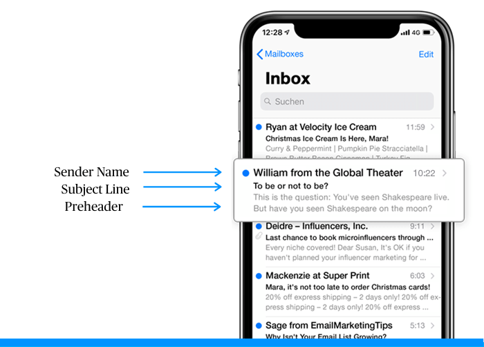
Sender name
We’re considering sender name as an element of email design. It’s a hugely influential factor when it comes to open rates and is arguably even more important than your subject line. Why? Because it’s inextricably linked to trust.
The first subconscious question readers ask themselves when scanning their inbox is ‘Is this genuine?’ Your contacts generally look at the sender name first to determine whether the email is spam.
The best way to reinforce trustworthiness and brand recognition is to incorporate your brand name into your sender name.
This could mean opting for your company name on its own, or personalizing it with an employee’s first name, for example, ‘Sarah at Team Debello’ Including a name can be an effective way to engage your readers on a more personal level.
Many larger companies use a distinct sender name to differentiate departments, products, services, or types of emails to reveal key information about the message itself, for example, ‘Team Debello-Magnetic Leads News’ or ‘Team Debello-Magnetic Leads Automation.’
The most important thing is to make sure your sender name displays a real name, whether it be the company’s name or an employee’s name – not just an email address.
Subject line
Aim to make your subject line relatively short (to avoid being truncated) but as informative as possible to capture your reader’s attention. This means highlighting the most important information that you want to communicate upfront. Users tend to only take a glance at the subject line, so you need to grab their attention with the first few words!
Based on the character limits set by various email providers, aim to limit your email subject line to 50 characters or less. In addition, be aware that mobile device users may see even less of the message.
TIP: Don’t overdo it with excessive capitalization, special characters, or punctuation. Not only will this kind of messaging compromise your reputation, but your email could also end up being classified as spam.
Email subject line A/B testing is a handy Team Debello-Magnetic Leads feature that can help you drastically improve your email open rates. This is your chance to entice your prospect to open and click, so don’t waste it – use data to determine which subject line works best!
Preheader text
Preheader text is the short snippet of text immediately following the subject line when viewing an email in the inbox. Preheaders add valuable context to your subject line and can also boost your open rates.
Your subject line and preheader text should work together to start telling your readers a story. If you don’t customize it, it will read as the text that first appears in your email, which could be ‘View this email in your browser’. Now that wouldn’t give a great first impression, would it? Get customizing!
2. Design your emails using visual hierarchy
As consumers, we tend to follow predictable patterns when engaging with content. Visual hierarchy is a powerful email design best practice that marketers can use in emails to exploit these tendencies.
Employing visual hierarchy not only allows your email content to be scanned and understood easily, but it also helps to direct your reader to the most important elements of your email.
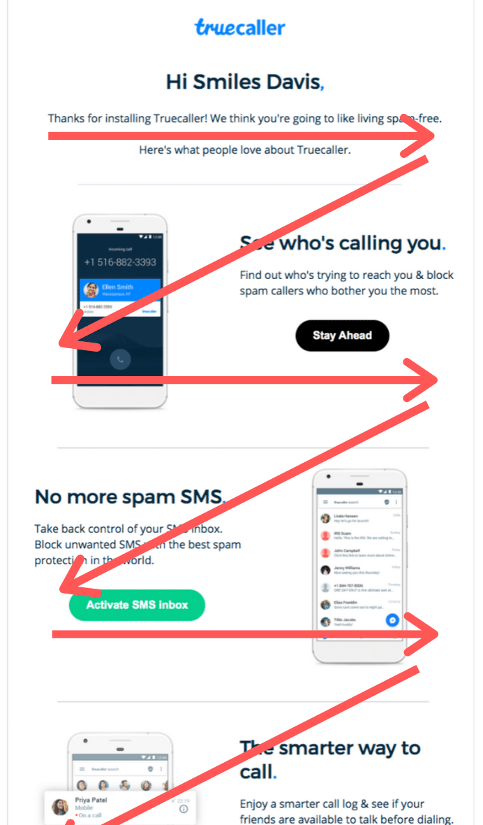
Let’s take a look at two email layouts utilizing visual hierarchy…
Email layouts
First, the Z pattern is an effective way to get subscribers to read through all your email content. (Or at least more than they otherwise would.) This strategy plays on patterns of eye movement. Reading left to right, we have a tendency to jump ahead when engaging with content.
As marketers, we can capitalize on this tendency by dispersing particularly eye-catching content throughout the copy. This way, readers are less likely to get bored part-way through.
Second, the inverted pyramid email layout is another strategy to consider. As you’ll see in the example below, this layout works by broadly catching readers’ attention at the top of the email before narrowing their focus to a call to action, product feature, or whatever the primary goal of your email is.

Whichever layout you opt for, your content should be arranged to tell a story that guides your reader toward the action that you want them to take. Email design aspects such as placement, size, color, contrast, and fonts all play an important role in establishing visual hierarchy.
Optimize your CTAs
Now’s a good time to discuss optimizing your CTAs. As you’ve seen in the examples above, there are CTA buttons placed strategically in accordance with the email layout.
This strategy helps boost click through rates. Laying out your content to figuratively point toward a call to action is like giving your contacts a gentle nudge.
As well, the text on your CTA buttons should be specific and to the point. If you’re promoting a new product line, you could write something like, “explore our new collection.” If you just launched a promotion, try something along the lines of “save 20% on shoes.”
Phrases like “read more” or “learn more” are better suited for lower level CTAs.
Some final tips on email layout:
Here are some additional factors to consider when mapping out your content:
People tend to place more value in objects that are larger, so consider displaying the most important information as larger blocks, in bigger fonts, or in heavier weights.
Elements higher up on the page are perceived as more important too, so start your email with the most important information.
Contrast is key, especially for readers who are scanning your email. Important elements, like your call-to-action, should generally stand out from the rest of the email.
Separating sections with white space allows the reader to understand where one element ends and the next begins. This helps to communicate information in a clear, organized, and attractive way.
NOTE Great email layout is also vital for accessibility. It’s important to make your email easily readable for all contacts, including those who are visually impaired. Don’t forget to include descriptive alt text for any images and make sure the background color of your emails allows for ease of reading.
3. Use an email template - email marketing
For those of us who aren’t experts in graphic design, using an email newsletter template is a great way to get started creating beautiful emails.
Email templates will help give your content a professional looking structure and speed up the design process.
As well, be sure to use responsive email templates. This means templates that automatically convert the content layout to be viewable on desktop, tablets, and mobile devices.
Your email marketing tool should have some type of drag and drop editor. This lets you create content without having to know HTML or code. Once you’ve selected a template, all you need to do is rearrange the design elements the way you like and add the email copy.
Now, to make the most of a template, you’ve got to go a bit further than replacing the placeholder text with your copy. Templates are a great foundation for effective email design. But moreso, they’re an opportunity for your brand image to shine through.
Don’t feel obligated to stick to a template’s design features. In fact, we recommend changing anything that isn’t consistent with your brand image like the background color or the fonts, for example!
To build a sense of reliability and trust with your audience, your email campaigns should be consistent in terms of design. This means sticking to a color scheme, font, heading structure, and a consistent email footer.
Email marketing design doesn’t have to be only for the big guys. Businesses of all sizes can create a brand image for their email campaigns. For inspiration, check out Coolors.co. Their site lets you experiment with different color palettes. Perfect for discovering your brand colors!
4. Add images where they add value - email marketing
Another email design best practice is using images where they add value.
Now, you may be tempted to flood your email campaigns with all your latest product photos. While photos are a great way to break up your email message and make your content a bit easier to digest, there’s something to be aware of.
Put yourself in the shoes of the email recipient here. Sending emails with too many photos, infographics, or illustrations can result in a few scenarios:
- Emails taking a long time to load;
- Issues in displaying the content;
- A vague and unfocused message to your audience.
To avoid these pitfalls, be sure to always ask yourself what kind of value an image adds to your content.
Including a few high-quality photos of your products, spotlighting a team member, and using an explanatory infographic are typically great ways to include images in your email campaigns.
By contrast, stock images or excessively large files are great ways to get your readers to click on the unsubscribe link.
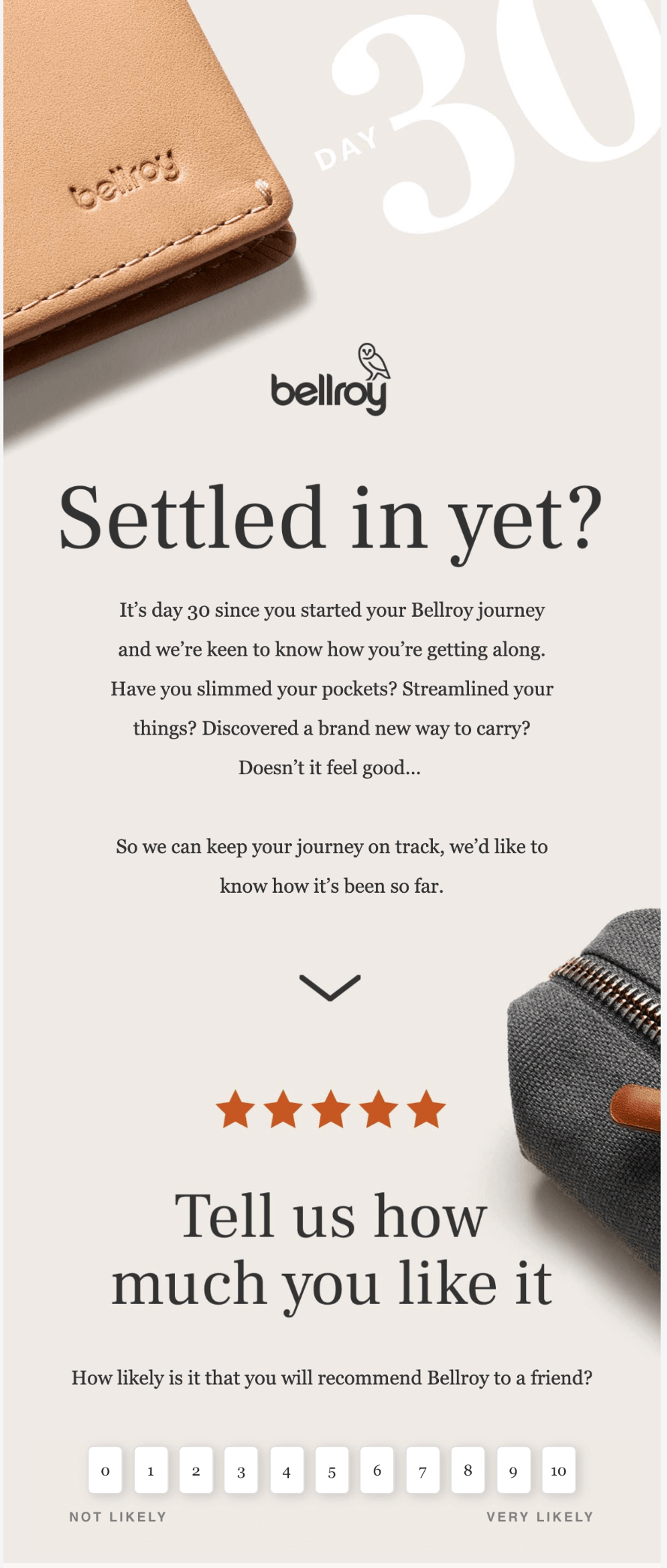
5. Use interactive content in your email design
Interactive email design is a powerful way to boost engagement by enabling subscribers to interact with content without ever leaving your email.
Interactive elements create a sort of gaming experience within the email that not only reduces barriers to engagement, but also provides a better user experience as subscribers can interact with content without the need to follow links or click through to your site. This is key to generating high intent clicks within your email.
Take a look at this example of an embedded survey in an email from Bellroy:
Here are some exciting interactive email elements to consider in 2023:
- Animated buttons and call-to-actions
- Hamburger menus and search options
- Product carousels
- Rollover effects to showcase products and offerings
- Offer reveals
Accordion features to make your emails more compact - Add-to-cart functionality
- Polls, surveys, and user-generated interactive content
Of course, you’re going to need skills in HTML and CSS to be able embed such interactive content into your emails using an email editor.
NOTE When you design interactive elements, keep in mind that not all email clients may display them correctly. You may need to create segments for email clients (Gmail, Apple Mail, etc.) to ensure optimal user experience.
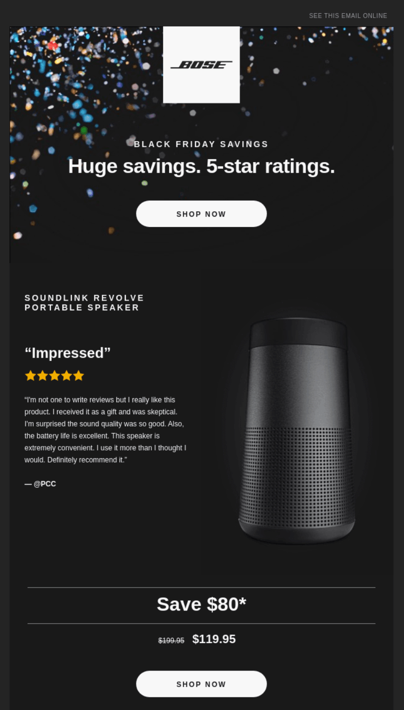
6. Feature user-generated content in your email design
The 2021 Edelman Trust Barometer Report found that 68% of consumers said trusting brands is more important today than ever before.
More often than not, people trust peer recommendations over brands. So why not let your customers have a say in your email content?
What is user-generated content?
User-generated content (UGC) is any piece of content that has been created by the end-user. This includes product reviews, customer feedback, photos, and social media posts.
Incorporating these elements into your email is an effective way to tap into social proof and reinforce your brand’s credibility and reliability. Highlighting real people brings a two-way dialogue into your emails that helps humanize your brand.
Through skilful targeting and segmentation, marketers can streamline the UGC experience by delivering personalized content, like reviews or Instagram posts, based on email subscriber interests and behavior.
Including relevant buyer endorsements across the email journey is a powerful method to drive conversions. Here’s an example of it in action:
7. Get personal with dynamic content
As we move into 2023, you can expect to hear less and less about B2B and B2C marketing and more about H2H – human-to-human marketing.
One of the biggest trends we’re seeing in email design is a move away from the one-to-many generic approach in favor of personalized one-to-one emails based on customer behavior.
Features like email automation, lead scoring, and segmentation mean content creation can be tailored to the individual like never before, resulting in the most dynamic, innovative, and subscriber-relevant email design to date.
What’s more, email personalization goes even further than using contacts’ first names in the greeting. We’re talking about dynamically changing entire sections of content based on a user’s interests and behavior, such as personalized product recommendations, offers, abandoned cart emails, and customer surveys.
For further reading, you may like the articles below!
5 Email Marketing Benefits for New Businesses
Quick fixes to improve your website conversion rate

