Website redesign SEO checklist: Retaining and improving SEO

A new website should be an opportunity to improve SEO, conversion rates and digital marketing as a whole. Unfortunately, it can also be an SEO disaster if not carefully managed. This is a website redesign seo checklist.

This article outlines the main areas you must consider when redesigning a website to ensure you retain (and improve) your SEO.

A cautionary tale

Maintaining traffic during a redesign can be tricky.

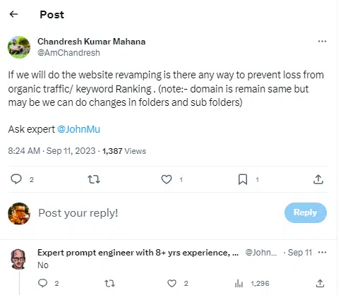
Google’s John Mueller was asked if there is a way to prevent traffic loss during a redesign, and he had a strong, simple answer – no.
Website redesign SEO checklist

During my career, I have seen many new, expensive, mission-critical websites that have wholly decimated important and profitable organic traffic.

However, one project has always stuck with me among the many horror stories.

The website was for a small multiple sclerosis (MS) charity. The charity promoted a natural approach to helping with MS and, as such, was not well-funded.

The site had gradually built organic traffic over several years but desperately needed a visual overhaul.

After a protracted website redesign involving two companies over 12 months, the new site finally launched. Everyone was super excited about taking things to the next level.

And then this happened:

Website redesign SEO checklist

Organic traffic dropped by over 90%. 

This was not simple turbulence – the traffic stayed low.

Excitement turned into panic.

After a month of waiting for things to improve and receiving no support from either of the web design agencies involved, we got the call and took it on as a pro bono project.

To try and resolve these issues after the fact is difficult.

It is hard enough if you consider your organic traffic from the outset – but to try and reverse engineer the problems is far more difficult.

Where SEO has not been considered, any number of problems may make recovering traffic problematic.

Fortunately, with much pain, wailing and gnashing of teeth, we recovered around 90% of the traffic. But it was painful for all involved.

Two years later, we helped architect a new site and weave SEO into the website planning, enabling the charity to supersede historic organic traffic.

With this site, we were careful to establish clear SEO goals and track SEO KPIs, so we understood what worked and used that to inform the website planning.

The SEO website redesign takeaway is simple – failing to plan is planning to fail. 

SEO and website redesign: The basics

Maintaining (and ideally improving) your rankings and organic traffic during a redesign has three key components:

  • An understanding of what works currently with your SEO.
  • Knowledge of common issues that crop up with a redesign.
  • A detailed plan of what will change on the new site.

My advice would always be to aim high. Don’t just try to retain traffic. Look to improve it. Research to understand both your SEO strengths and weaknesses. 

Let us look at each of these areas in more detail.

What works currently

If you are running SEO campaigns, you should (hopefully) have a good idea of what is working currently: keywords and topics that rank, pages that bring in organic traffic and any other organic visibility.

By clearly documenting what works, you can ensure this is factored into the design and planning for the new website – you can’t rank for something that is no longer there!

Common issues

There are many reasons for a site redesign, and this can be as much to do with branding and technology as it can be with traffic and lead generation.

Things that typically can change or be problematic for SEO during a redesign include:

  • Content can be removed. (It won’t rank if it is not there!)
  • Content can be changed.
  • Content may move within the site’s hierarchy.
  • URLs may change.
  • Page-level optimization may change.
  • New content can be added.
  • New sections can be added to the site.
  • New technology or features may be used.
  • New technical issues can be introduced.
  • Internal link structure could change.
  • The domain name may change.
  • The subdomain may change.
  • The protocol may change.

Any of the above can cause issues with your SEO. And if there are multiple issues, such as content changing and being moved to a new URL, then it gets harder to diagnose the root cause of problems.

Multiple issues can multiply your SEO problems. Changing your website's domain, hosting, CMS and architecture in one go? This will multiply the likelihood of SEO problems.

Have this conversation with the team so you can balance the desire for change with the need to retain and improve organic traffic. Remember, you don’t need to do everything at once in most cases, so minimize the variables.

Ensure that during all website planning discussions, an SEO stakeholder is involved and armed with information on what works and must be factored into the new site.

Get SEO in at the planning stage – don’t try to fix things when development has started.

What will change with the redesign?

Armed with a knowledge of what works and what can go wrong, you can review the goals for the new site.

Two key SEO goals should be:

  • To preserve the existing rankings and traffic.
  • To improve the rankings and traffic.

Ideally, you will have a complete sitemap for the new site that you can use to compare against the existing site and create mappings for URL moves.

Website redesign SEO checklist

Fortunately, with some preplanning, avoiding SEO disasters and maintaining SEO during a website redesign is pretty straightforward. Website redesign SEO checklist.

Following the stages in this website redesign SEO checklist will ensure you preserve your precious SEO rankings and traffic.

1. Keep the old site live

Keep the old site live on a private web address if you can. Make sure a crawler can’t access the site.

Some HTTP authentication is best, but having the old site to refer to when you hit a snag can be a godsend.

Some or part of the site will often be on the web archive, but having the real thing is way better.

2. Save crawl data

Save a crawl of the old site, even if you have the site on a temp URL. Screaming Frog is great for this, and again, you can load up the old site crawl if you need to do any analysis.

3. Don’t fix what is not broken

Keep things the same where you can – particularly URLs. If you can keep the URL structure and page names the same, there is way less that can go wrong.

If you have to make changes, so be it. But make sure they are warranted for the greater good, not just done for the heck of it.

Remember, you don’t need to keep things that are not working.

4. Set up 301 redirects

Redirecting old URLs to new ones should be the first job on your list. If possible, keep content on the duplicate URLs when redesigning a site.

For instance, a WordPress or Shopify redesign can keep the same URL structure. This is desirable. If not, you will want a spreadsheet of all URLs on the old and new sites to implement and test your 301 redirects.

When the new site is live, you will want to crawl the old list of URLs (another time that saved crawl comes in handy) to ensure everything 301 redirects correctly.

5. Maintain your content

Where you have content that performs well, you’ll want to minimize changes (or improve it).

There will be plenty of opportunities to tweak your content in its new home after it is indexed and ranked, but for now, aim to minimize the variables of change.

6. Optimize for on-page elements

Crawling your old site will allow you to easily export all key on-page elements: page titles, meta descriptions, headers, etc.

Where the site is well optimized, keep these elements the same.

Document your backlinks and where URL changes are made. Attempt to update these links – research in Google Search Console and the typical link index tools.

Once you have a list, contact the website managers to update these where possible. You should have a 301 in place, so don’t lose any sleep over this, but updated backlinks can help get the new site indexed and ranking quickly.

Be mindful of any changes to the internal link structure. Again, your historic crawl data can be helpful here.

If you have pages that had thousands of internal links previously but are now barely linked, then this can impact the rankings for that page.

9. Update your XML sitemap

Update your XML sitemap and submit it to Google and Bing.

We want our 301s, page structure, navigation and XML sitemap to align and indicate the new site structure to help search engines understand the changes quickly.

10. Monitor rankings

You can expect some fluctuations, but you should be back at a baseline within a month or so of launch (ideally sooner).

If you have issues, investigate them now to identify and resolve them. Sometimes, with more significant sites, it can take longer for deeper pages to be recrawled, so be mindful of this. Website redesign SEO checklist.

11. Monitor organic traffic

For larger sites, you can never rank-track every possible keyword that drives traffic, so also monitor traffic to key pages to ensure you see improvements.

You can compare a simple before and after using Google Search Console that will clearly document any drops so you can take action.

12. Do a technical site audit

Ideally, use a technical site audit tool to provide proactive information on any technical issues.

13. Use Google Search Console

Google Search Console keeps improving and will give you diagnostic information directly from Google. Here you can track:

  • Indexing.
  • Sitemaps.
  • Page experience.
  • Mobile usability.
  • Products.
  • Enhancements.
  • Links.

If you have problems, the information here can help you track and remediate them. Website redesign SEO checklist. 

Retain and improve your SEO during a redesign

The crucial factor here is planning.

New websites fail in many ways, but always due to a lack of diligent planning.

SEO failures in website redesigns are, in our experience, nearly always down to a lack of planning and a clear and well-articulated SEO plan for the new site. 

Ensure that SEO is factored into the website redesign process, and you can launch your new site confidently.
How to calculate your SEO ROI


2023-08-24_22-18-40

Why use a CRM

A Customer Relationship Management (CRM) system is a software tool designed to help businesses manage and optimize their interactions with customers and potential customers throughout the entire customer lifecycle. There are several reasons why businesses use CRM systems:

1. **Centralized Customer Data**: CRM systems store and organize customer information in a central database. This allows businesses to have a holistic view of their customers, including contact details, purchase history, interactions, preferences, and more. Having all this information in one place enables better decision-making and personalized communication.

2. **Improved Customer Service**: CRM systems facilitate better customer service by providing quick access to customer information. When a customer contacts the company, the support team can easily retrieve relevant information, understand the customer's history, and provide more tailored assistance, leading to a better customer experience.

3. **Sales and Lead Management**: CRM systems help sales teams manage leads, track sales opportunities, and forecast revenue. By capturing interactions with leads and customers, businesses can better understand their sales pipeline, identify potential bottlenecks, and make data-driven decisions to improve sales processes.

4. **Marketing Automation**: CRM systems often integrate with marketing automation tools. This integration allows businesses to create targeted marketing campaigns, segment their audience, and send personalized messages based on customer behavior and preferences.

5. **Data Analysis and Reporting**: CRM systems offer reporting and analytics features that provide insights into customer behavior, sales trends, and overall business performance. This data-driven approach helps businesses make informed decisions and adjust their strategies as needed.

6. **Task and Time Management**: CRM systems can help teams manage tasks, appointments, and follow-ups. This ensures that important interactions with customers are not overlooked and helps maintain a consistent and organized approach to customer interactions.

7. **Enhanced Collaboration**: CRM systems often have collaboration features that enable different teams within an organization (sales, marketing, customer service) to work together seamlessly by sharing customer information, notes, and updates.

8. **Customer Segmentation and Personalization**: By categorizing customers into segments based on their behaviors and preferences, businesses can create personalized marketing messages and offers, increasing the chances of engagement and conversion.

9. **Customer Retention and Loyalty**: A CRM system can help track customer interactions, enabling businesses to proactively address concerns, provide timely support, and build stronger relationships. Satisfied customers are more likely to become repeat buyers and advocates for the brand.

10. **Scalability and Growth**: As a business expands, managing customer relationships manually becomes challenging. A CRM system provides a scalable solution that can accommodate larger volumes of customer data and interactions without sacrificing quality.

In essence, a CRM system streamlines and optimizes customer-related processes, leading to improved customer satisfaction, increased sales, and more efficient internal operations. It allows businesses to build stronger, more personalized relationships with their customers, which ultimately contributes to long-term success.

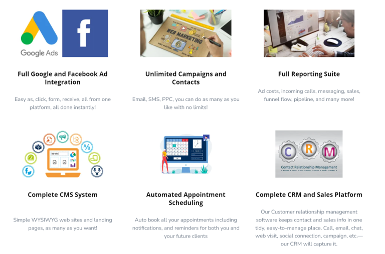
Team Debello's custom configured CRM platform is called Magnetic-Leads and has all the tools and integrations you need for marketing, sales, content management, and analytics reporting. Each product in the platform is powerful alone, but the real magic happens when you use them together.

These 5 ways can help improve your PPC lead quality

Online leads are not all equal. The quality of those leads ultimately matters in driving meaningful business outcomes.

Focusing on high-quality leads in your PPC campaigns increases your return on investment for your marketing dollars.

Additionally, improving lead quality allows salespeople to focus on more promising opportunities, streamline their sales process, and cultivate a loyal customer base.

Here are the tools and strategies you can employ to drive better leads and more ideal customers to your doorstep:

Key 1: Teach Google what a good lead looks like

Google’s ad bidding algorithm is a sophisticated system determining whom to target and how much to pay for a click.

The algorithm considers many factors, such as the bid, the ad and landing page quality, the expected click-through rate, and other historical performance data.

The better quality data you can provide to Google, the better the algorithms will do your bidding (literally).

You can do this by providing Google the following:

  • Clean conversion tracking, depending on what clean means for you.
  • Customer lists that are filtered for your highest-quality customers while meeting the 1,000-user threshold.
  • Conversion values for designating more highly profitable leads from others.

Positive feedback loops

Algorithms like Google’s ad bidding system are designed to continuously improve performance by leveraging a feedback loop. This loop allows the algorithm to learn from past decisions and adjust its strategies for better outcomes.

When the algorithm receives accurate and high-quality initial inputs, it establishes a strong foundation for this learning process. The algorithm can make increasingly precise bidding decisions as it refines its understanding of user behaviors and preferences.

Fueled by the right inputs, this positive feedback loop results in more accurate learnings and better bidding decisions, enhancing campaign effectiveness and improving return on investment.

Key 2: Don’t neglect offline conversion tracking

One of the best practices for improving your PPC lead quality is offline conversion tracking or Enhanced Conversions for Leads.

Offline conversion tracking in Google Ads lets you link online ad interactions with offline actions, like in-store purchases or phone orders.

Doing so better informs Google’s bidding algorithms on what and who to optimize for increased profits and offline sales.

Here’s how it works:

High-quality lead data curation

Compile your online leads that generated revenue offline with an average volume of 30 or more per month and an average lag of 90 days or less.

Consider creating a database of all of the high-quality leads generated, whether they purchased or not. This is recommended because we aim to inform Google of the ideal lead candidates and to generate more of these, whether they become customers or not.

Integration with CRM or database

Next, integrate your offline data with Google Ads. This can be done by collecting and associating a Google Click ID (GCLID) with your leads.

Alternatively, consider using Enhanced Conversions for Leads for less technical and more streamlined implementation.

Ideally, you will have an automatic upload of this data into Google Ads regularly. If you use Salesforce or HubSpot, Google Ads has an easy and direct integration for uploading these offline sales conversions.

Attribution and reporting

Once Google matches the lead with the originating click ID, it can attribute the ads, keywords, campaigns, etc., that drive these valuable offline actions.

You can see reporting on the associated metrics like conversion value, conversion rate, and return on ad spend (ROAS).

Identify optimization opportunities

This data lets you understand which keywords, ads, or campaigns drive the most valuable offline conversions.

These insights will help you to make informed decisions about budget allocation, keywords, ad creatives, and targeting to optimize your campaigns.

Google Ads conversion tracking

Key 3: Exclude low-quality lead sources

Once you can identify what is generating your best-quality leads, you want to use these insights to pull spending away from your low-quality lead sources.

Audience demographics such as age and household income levels will come to light.

For example, you could discover that conversions are from 18- to 24-year-olds but not revenue. Use this discovery to exclude those age demographics from accruing ad spending in your campaigns.

Placement exclusions

Regularly check your placements report for low-quality websites, apps, and YouTube channels where your ads showed.

This can be tedious, but it will allow you to exclude placements that do not align with your brand or match your targeting. This is a great strategy to exclude low-quality lead sources.

Google Ads placement exclusions

Turn off demographics expansion

If you use demographic exclusions to improve lead quality, it is crucial to understand that Video Action campaigns using optimized targeting will ignore these exclusions.

Be sure to submit a request to your Google rep for whitelisting to turn off the demographics expansion.


Get the daily newsletter search marketers rely on.


Key 4: Attract high-quality leads who want to do business with you.

How good is your brand at attracting your ideal prospects, and does this high-caliber lead want to work with you?

If you're facing challenges in attracting quality leads to your brand or would like to improve overall, start by evaluating and enhancing your brand strategy.

Consider refreshing your brand identity, including your website, ads, logos, and colors. Be sure these are all effectively resonating with your desired customers.

Revisit your target audience and ensure your brand's messaging aligns with their preferences and needs. Clarify your value proposition, highlighting how your brand addresses users’ specific problems.

Last, embrace personalization to connect with different segments of your audience and resonate more deeply.

Examples include personalized landing pages, dynamic website content based on the visitor’s preferences and behavior-based retargeting ads.

Key 5: Disqualify leads before they reach a salesperson

I learned this from Perry Marshall, who has a story from John Paul Mendocha about “racking the shotgun,” and it’s about applying the 80/20 rule to your prospecting.

Ideally, you would disqualify folks before they click on your ad, costing you money. You can apply these other techniques after excluding your low-quality lead sources.

Use price as a disqualifier

Some prospecting strategies include concealing the price. I recommend using it as a disqualifier. You will likely prevent the leads from entering your funnel who cannot afford what you offer.

Disqualify leads with your online form

If displaying your price doesn’t make sense, use your online form to ask a qualifying question about the budget or how much they plan to invest. Doing so allows you to route leads with more profitable follow-up tactics based on their response.

Urgency is another qualifier that can be asked online, such as how significant is this problem they are trying to solve? One way would be to ask for their timeframe.

Alternatively, they can rank the importance of finding a solution from one to five.

Disqualify leads over chat

Similarly to the online form, use chat to help disqualify potential leads just as much as you would try to convert them. Ask the same qualifying questions to identify if your solution doesn’t fit their needs.

Bonus key: Get targeting feedback directly from salespeople

One bonus point for improving your PPC lead quality is getting targeted feedback directly from salespeople.

As PPC marketers, we tend to work in a black box. Getting insights directly from salespeople can help inform our targeting and exclusion strategies.

Not only can this make our direct campaigns more profitable, but sending through more highly qualified leads improves the results for the salespeople, increases retention, enhances your brand reputation, and reduces wasted resources.

Increase lead quality to increase your resources

Improving lead quality can significantly impact a business across various aspects. This impact will be more significant if most of your leads come from PPC sources.

Ultimately, focusing on lead quality can lead to more efficient resource allocation, better customer relationships, increased conversion rates, higher revenue and overall business success.

7 Email Design Best Practices for 2023 - Email Marketing

Let's talk email marketing - We’ve put together a list of our favorite email design best practices to help you increase open rates, drive conversions, and grow your customer base in 2023.

Research shows that in 2019, roughly 294 billion emails were sent worldwide every day. That figure is expected to reach 347 billion by 2023.

Yet many of these emails remain unread, or even worse – unopened. They get marked as spam, deleted, or completely ignored.

That’s why a well-designed, attractive email is essential to drive engagement and conversions. From the moment an email appears in your reader’s inbox, you want them to feel compelled to click through, even after just a glance. Beautifully designed and informative emails result in greater ROI and fewer unsubscribers.

To make the most of these best practices, follow along in your Team Debello-Magnetic Leads account and create your own stunning email content. Don’t have an account yet? Create one today!

Magnetic Leads free plan includes access to, email templates, unlimited contact storage, email marketing automation features, and more.

1. Nail your email marketing basics - email marketing

First impressions count for a lot in the world of marketing, and your emails are no exception.

You can spend all the time in the world crafting compelling email copy, but if your envelope content doesn’t hit the mark, it’s unlikely that your target audience will engage much. (That means low click through rates.)

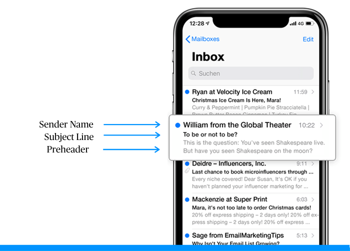
Your envelope content consists of three key elements: sender name, subject line and a preheader. These are the basic foundations of effective email marketing. Without them, your body copy doesn’t stand a chance of holding its own. No one seems to want to use the preheader, why, because most 3rd party email tools cant create one, OR, you just didn't want to, but its really part of email basics to use it.

Photo of an email inbox on a mobile device. Arrows labelling the sender name, subject line, and preheader.

Sender name

We’re considering sender name as an element of email design. It’s a hugely influential factor when it comes to open rates and is arguably even more important than your subject line. Why? Because it’s inextricably linked to trust.

The first subconscious question readers ask themselves when scanning their inbox is ‘Is this genuine?’ Your contacts generally look at the sender name first to determine whether the email is spam.

The best way to reinforce trustworthiness and brand recognition is to incorporate your brand name into your sender name.

This could mean opting for your company name on its own, or personalizing it with an employee’s first name, for example, ‘Sarah at Team Debello’ Including a name can be an effective way to engage your readers on a more personal level.

Many larger companies use a distinct sender name to differentiate departments, products, services, or types of emails to reveal key information about the message itself, for example, ‘Team Debello-Magnetic Leads News’ or ‘Team Debello-Magnetic Leads Automation.’

The most important thing is to make sure your sender name displays a real name, whether it be the company’s name or an employee’s name – not just an email address.

Subject line

Aim to make your subject line relatively short (to avoid being truncated) but as informative as possible to capture your reader’s attention. This means highlighting the most important information that you want to communicate upfront. Users tend to only take a glance at the subject line, so you need to grab their attention with the first few words!

Based on the character limits set by various email providers, aim to limit your email subject line to 50 characters or less. In addition, be aware that mobile device users may see even less of the message.

TIP: Don’t overdo it with excessive capitalization, special characters, or punctuation. Not only will this kind of messaging compromise your reputation, but your email could also end up being classified as spam.

Email subject line A/B testing is a handy Team Debello-Magnetic Leads feature that can help you drastically improve your email open rates. This is your chance to entice your prospect to open and click, so don’t waste it – use data to determine which subject line works best!

Preheader text

Preheader text is the short snippet of text immediately following the subject line when viewing an email in the inbox. Preheaders add valuable context to your subject line and can also boost your open rates.

Your subject line and preheader text should work together to start telling your readers a story. If you don’t customize it, it will read as the text that first appears in your email, which could be ‘View this email in your browser’. Now that wouldn’t give a great first impression, would it? Get customizing!

2. Design your emails using visual hierarchy
As consumers, we tend to follow predictable patterns when engaging with content. Visual hierarchy is a powerful email design best practice that marketers can use in emails to exploit these tendencies.

Employing visual hierarchy not only allows your email content to be scanned and understood easily, but it also helps to direct your reader to the most important elements of your email.

Let’s take a look at two email layouts utilizing visual hierarchy…

Email layouts

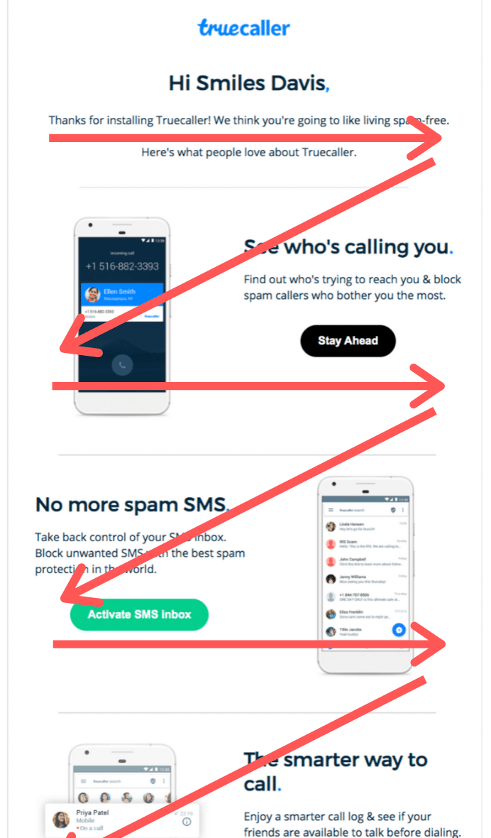
First, the Z pattern is an effective way to get subscribers to read through all your email content. (Or at least more than they otherwise would.) This strategy plays on patterns of eye movement. Reading left to right, we have a tendency to jump ahead when engaging with content.

As marketers, we can capitalize on this tendency by dispersing particularly eye-catching content throughout the copy. This way, readers are less likely to get bored part-way through.

Email example from Truecaller with arrows indicated the Z pattern of content

Second, the inverted pyramid email layout is another strategy to consider. As you’ll see in the example below, this layout works by broadly catching readers’ attention at the top of the email before narrowing their focus to a call to action, product feature, or whatever the primary goal of your email is.

A newsletter by Strava with overlaid arrows indicating the inverted pyramid content structure.

Whichever layout you opt for, your content should be arranged to tell a story that guides your reader toward the action that you want them to take. Email design aspects such as placement, size, color, contrast, and fonts all play an important role in establishing visual hierarchy.

Optimize your CTAs

Now’s a good time to discuss optimizing your CTAs. As you’ve seen in the examples above, there are CTA buttons placed strategically in accordance with the email layout.

This strategy helps boost click through rates. Laying out your content to figuratively point toward a call to action is like giving your contacts a gentle nudge.

As well, the text on your CTA buttons should be specific and to the point. If you’re promoting a new product line, you could write something like, “explore our new collection.” If you just launched a promotion, try something along the lines of “save 20% on shoes.”

Phrases like “read more” or “learn more” are better suited for lower level CTAs.

Some final tips on email layout:

Here are some additional factors to consider when mapping out your content:

People tend to place more value in objects that are larger, so consider displaying the most important information as larger blocks, in bigger fonts, or in heavier weights.
Elements higher up on the page are perceived as more important too, so start your email with the most important information.

Contrast is key, especially for readers who are scanning your email. Important elements, like your call-to-action, should generally stand out from the rest of the email.

Separating sections with white space allows the reader to understand where one element ends and the next begins. This helps to communicate information in a clear, organized, and attractive way.

NOTE Great email layout is also vital for accessibility. It’s important to make your email easily readable for all contacts, including those who are visually impaired. Don’t forget to include descriptive alt text for any images and make sure the background color of your emails allows for ease of reading.

3. Use an email template - email marketing

For those of us who aren’t experts in graphic design, using an email newsletter template is a great way to get started creating beautiful emails.

Email templates will help give your content a professional looking structure and speed up the design process.

As well, be sure to use responsive email templates. This means templates that automatically convert the content layout to be viewable on desktop, tablets, and mobile devices.

Your email marketing tool should have some type of drag and drop editor. This lets you create content without having to know HTML or code. Once you’ve selected a template, all you need to do is rearrange the design elements the way you like and add the email copy.

Now, to make the most of a template, you’ve got to go a bit further than replacing the placeholder text with your copy. Templates are a great foundation for effective email design. But moreso, they’re an opportunity for your brand image to shine through.

Don’t feel obligated to stick to a template’s design features. In fact, we recommend changing anything that isn’t consistent with your brand image like the background color or the fonts, for example!

To build a sense of reliability and trust with your audience, your email campaigns should be consistent in terms of design. This means sticking to a color scheme, font, heading structure, and a consistent email footer.

Email marketing design doesn’t have to be only for the big guys. Businesses of all sizes can create a brand image for their email campaigns. For inspiration, check out Coolors.co. Their site lets you experiment with different color palettes. Perfect for discovering your brand colors!

4. Add images where they add value - email marketing

Another email design best practice is using images where they add value.

Now, you may be tempted to flood your email campaigns with all your latest product photos. While photos are a great way to break up your email message and make your content a bit easier to digest, there’s something to be aware of.

Put yourself in the shoes of the email recipient here. Sending emails with too many photos, infographics, or illustrations can result in a few scenarios:

  • Emails taking a long time to load;
  • Issues in displaying the content;
  • A vague and unfocused message to your audience.

To avoid these pitfalls, be sure to always ask yourself what kind of value an image adds to your content.

Including a few high-quality photos of your products, spotlighting a team member, and using an explanatory infographic are typically great ways to include images in your email campaigns.

By contrast, stock images or excessively large files are great ways to get your readers to click on the unsubscribe link.

5. Use interactive content in your email design

Interactive email design is a powerful way to boost engagement by enabling subscribers to interact with content without ever leaving your email.

Interactive elements create a sort of gaming experience within the email that not only reduces barriers to engagement, but also provides a better user experience as subscribers can interact with content without the need to follow links or click through to your site. This is key to generating high intent clicks within your email.

Take a look at this example of an embedded survey in an email from Bellroy:

An email newsletter by Bellroy which includes an embedded survey. Survey asks "how likely is it that you will recommend Bellroy to a friend?" and allows readers to select a box from 1 to 10.

Here are some exciting interactive email elements to consider in 2023:

  • Animated buttons and call-to-actions
  • Hamburger menus and search options
  • Product carousels
  • Rollover effects to showcase products and offerings
  • Offer reveals
    Accordion features to make your emails more compact
  • Add-to-cart functionality
  • Polls, surveys, and user-generated interactive content

Of course, you’re going to need skills in HTML and CSS to be able embed such interactive content into your emails using an email editor.

NOTE When you design interactive elements, keep in mind that not all email clients may display them correctly. You may need to create segments for email clients (Gmail, Apple Mail, etc.) to ensure optimal user experience.

6. Feature user-generated content in your email design

The 2021 Edelman Trust Barometer Report found that 68% of consumers said trusting brands is more important today than ever before.

More often than not, people trust peer recommendations over brands. So why not let your customers have a say in your email content?

What is user-generated content?
User-generated content (UGC) is any piece of content that has been created by the end-user. This includes product reviews, customer feedback, photos, and social media posts.

Incorporating these elements into your email is an effective way to tap into social proof and reinforce your brand’s credibility and reliability. Highlighting real people brings a two-way dialogue into your emails that helps humanize your brand.

Through skilful targeting and segmentation, marketers can streamline the UGC experience by delivering personalized content, like reviews or Instagram posts, based on email subscriber interests and behavior.

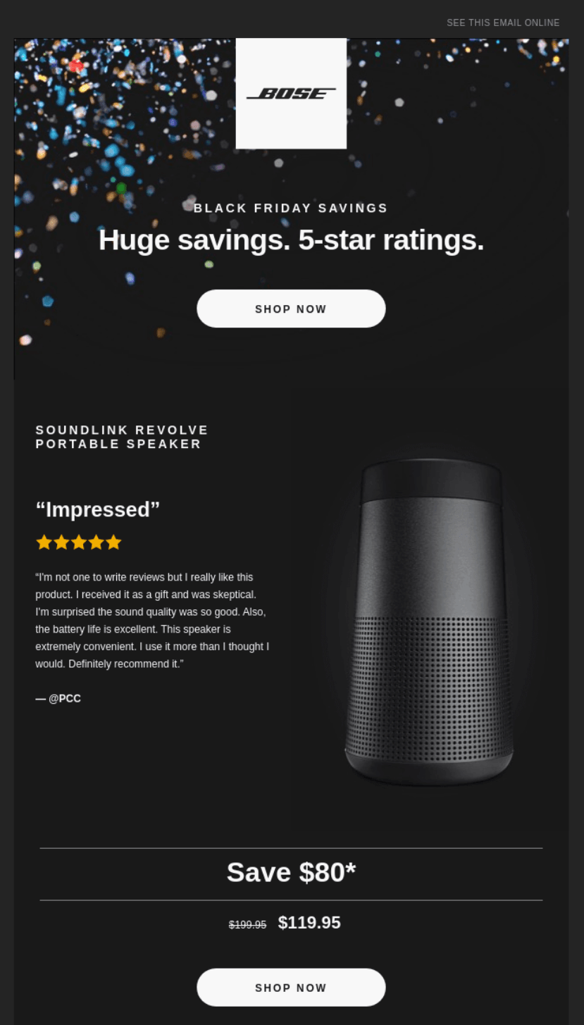
Including relevant buyer endorsements across the email journey is a powerful method to drive conversions. Here’s an example of it in action:

Newsletter campaign by Bose which includes user generated content in the form of a quotation from a satisfied customer.

7. Get personal with dynamic content

As we move into 2023, you can expect to hear less and less about B2B and B2C marketing and more about H2H – human-to-human marketing.

One of the biggest trends we’re seeing in email design is a move away from the one-to-many generic approach in favor of personalized one-to-one emails based on customer behavior.

Features like email automation, lead scoring, and segmentation mean content creation can be tailored to the individual like never before, resulting in the most dynamic, innovative, and subscriber-relevant email design to date.

What’s more, email personalization goes even further than using contacts’ first names in the greeting. We’re talking about dynamically changing entire sections of content based on a user’s interests and behavior, such as personalized product recommendations, offers, abandoned cart emails, and customer surveys.

For further reading, you may like the articles below!

5 Email Marketing Benefits for New Businesses

Quick fixes to improve your website conversion rate

Why email marketing is crucial for businesses

20 things your website should do and 5 things it shouldnt

Have A Question?
Ready For Answers?
Call Us 1-949-954-7769
eMail us at: wantmore@teamdebello.com

Have A Question?
Ready For Answers?
Call Us 1-949-954-7769
eMail us at: wantmore@teamdebello.com