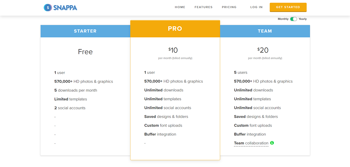
1. Control for visual attention
If you don’t think about how you manage attention on your site, users are going to have a rough time trying to find what they need. The elements on your pages are not of equal importance – why should they have equal visual weight?
You should drive visual attention to the elements that matter most.
Here are some things you can use:
- Size – make the important elements larger without making them so large that the web site becomes tacky
- Shape – if your template allows for irregular shapes, use irregular shapes like rounded corners on your calls-to-action (CTA). Irregular shapes attract more attention than straight lines
- Color contrast – your theme should largely be one color, and the CTAs should have a high contrast with that primary color to attract more attention
2. Have a clear call-to-action
Every page should be intended for a specific kind of user intent.
- People who are researching a product should go to your educational pages rather than your product details
- Users looking for options should be driven to your category pages
- Visitors who are near the bottom of the funnel but not ready to pull the trigger should go to your trial pages
The CTAs on those pages should match the objectives of the user. You need to think carefully about your buttons:
- CTAs should complete an “I want to” statement (e.g. “I want to … complete order/download trial”)
- CTAs should be adjusted to the stage of the customer journey (don’t immediately give people in the
![]()
3. Format copy for scannability
Humans are satisficers.
That is, on the web, we are not likely to seriously weigh options and then decide on a plan of attack. Rather, we are likely to examine one option, and if it’s good enough that we don’t see serious issues, we plow ahead without examining the other options.
What that means for web sites is that people scan a lot, read very little, and upon finding a good enough option, they’ll proceed to click without thinking if the other options you provide are a better fit for what they need. You need to have a web site that supports that behavior.
Your web site needs bullet points, bolded headlines and sub-headlines, and good grouping, so it’s easy to scan.
4. Make your content easy to read
Everyone prefers simple language on the web, even experts and specialists. That means you need to make sure your content is written the right way:
- Avoid jargon where possible
- 5th grade reading ability is the sweet spot. Use tools that implement Flesch–Kincaid readability tests. Then, refine your content until you get at least close to 5th-grade-readable-content
- If you have an international audience, limit the use of idioms
5. Limit choices
We can only use our short-term memory to remember 5-9 things. So, if you have a category list that spans 13 items, for example, you need to trim the options even at the cost of asking the users to make one more click.
Deep content where people need to make easy clicks are better for web usability than fewer, more difficult clicks.
If you make sure you don’t put a strain on the user’s memory load, your visitors will thank you.
6. Get users to trust you
If people don’t trust you, they won’t buy from you. There are proven techniques to increase visitor trust:
- Put trust symbols above the fold – a lot of companies have trust symbols, but lower on the page. Don’t make that mistake – if people can’t see your trust symbols easily, they might as well be invisible
- Borrow trust – use your media mentions, and display logos of large companies who have bought your goods and services to increase trust
- Social proof – if you have a large enough customer base, display the number of customers on your pages to take advantage of the bandwagon effect
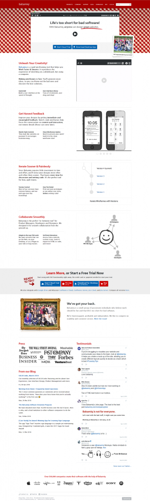
Balsamiq’s home page has some persuasive social proof and borrowed authority, but they’re bound to be missed because they’re buried towards the bottom of the page.
7. If you have ads, make sure the headlines line up
For people running search ads, one of the most common mistakes is not aligning the content of the link on the ad to the headline of the page the ad goes to.
The headline needs to match the ad so you deliver on your promises. This means more work creating landing pages, but you’ll give your landing pages a higher shot at making visitors convert.
8. Make your pages focused
Outside your web site (on a Google result page, etc.), you need to be loud and compete for attention. Once people are on your web site, you need to quiet down and get people to focus on what they need:
- Limit the use of visual distractions, especially stock images
- Avoid moving elements like rotating banners
9. Earn the right to ask for information
Establish a relationship before you ask for information. When your business relies on signups as part of the conversion path, you can’t afford to be a greedy marketer. You need to stop sending people to 15-field forms before they’ve had the chance to get to know you:
- Ensure you have a ready set of loss leader PDFs or trials that you can “trade” for user information
- Users are not likely to give you information until you provide value, so don’t bombard them with signup forms immediately
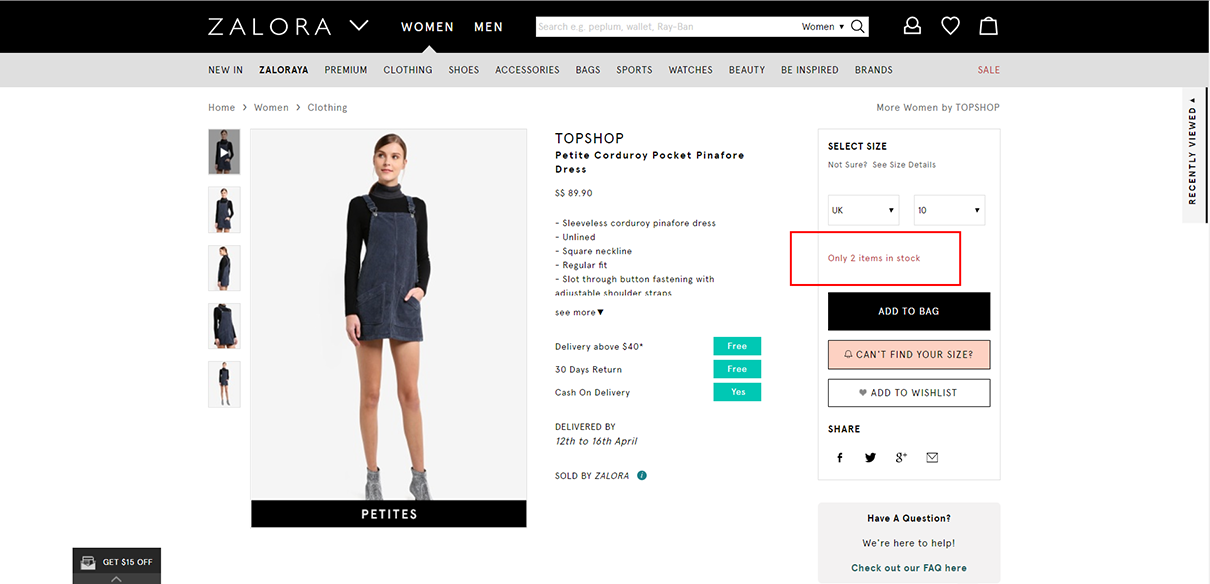
10. Nudge users to convert using scarcity
If people are just about ready to convert, but they need a final nudge to act now, your pages can include the following elements:
- Limited time offers – this can make people act sooner rather than later
- Stock availability – for those items where the scarcity can make people act on that same visit
Improve Website Conversion Rate with Best Practices
Don’t rely on tests for everything. Your site needs to be sound before you run your tests. If your pages are terrible, your champion and challenger pages will both suck. And you’ll just find the more viable of two bad pages.
If you follow best practices, then run your tests, you’d be more likely to make your site succeed.

